COVERLAB staff is currently working on geospatial analysis of CMV crashes in North Carolina. A number of different techniques are being explored and will be deployed as web map layers when complete.
Crash Density
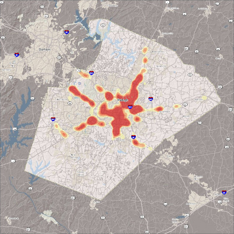
Truck crash occurrences per square mile.
Where are there lots of truck crashes? Density grids are useful for quickly visualizing the spatial distribution of point data; in this case, truck crashes. Kernel density calculates the density of features in a search radius around those features. The surface value is highest at the location of the point and diminishes with increasing distance from the point, reaching zero at the search radius distance from the point.
Crash Rates
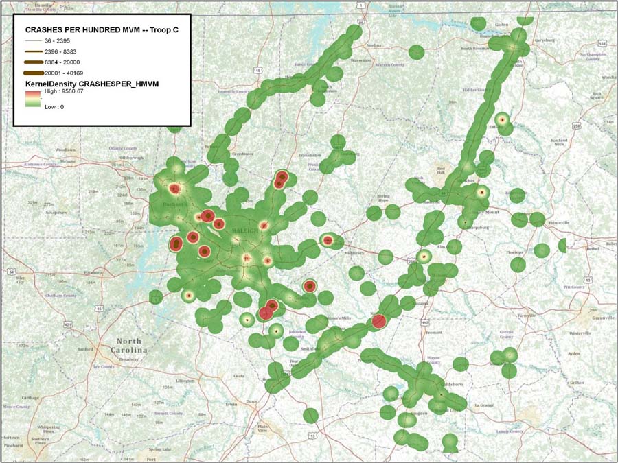
Frequency of truck crashes when accounting for traffic.
By normalizing truck crashes for traffic volume, we can start to identify visual patterns that are not readily apparent by looking at crash density alone. This map shows a test area for Troop C. COVERLAB staff is currently working on identifying and appropriate methodologies for developing this layer.
Hot Spots
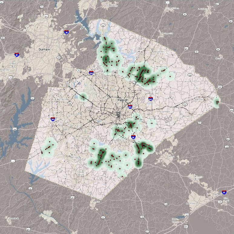
Where truck crashes are statistically clustered or dispersed.
Are high or low numbers of crashes grouped together more than you would expect from random chance alone?
This map shows hot spots of truck crashes in Wake County that are statistically clustered at the 95% (>=1.96) confidence interval using crash severity as a weighted value. A Getis-Ord Gi* z-score was calculated for each feature based on a weighted value using the ArcGIS Hot Spot Tool. COVER Lab staff is currently working on developing methodologies to identify hot spots along a road network.
Hot spot crash identification is being developed to help avoid the tendency to mistake crash frequency with statistical crash risk. This method introduces statistical rigor to geospatial visualization and helps focus enforcement efforts where they are most needed.
Clusters
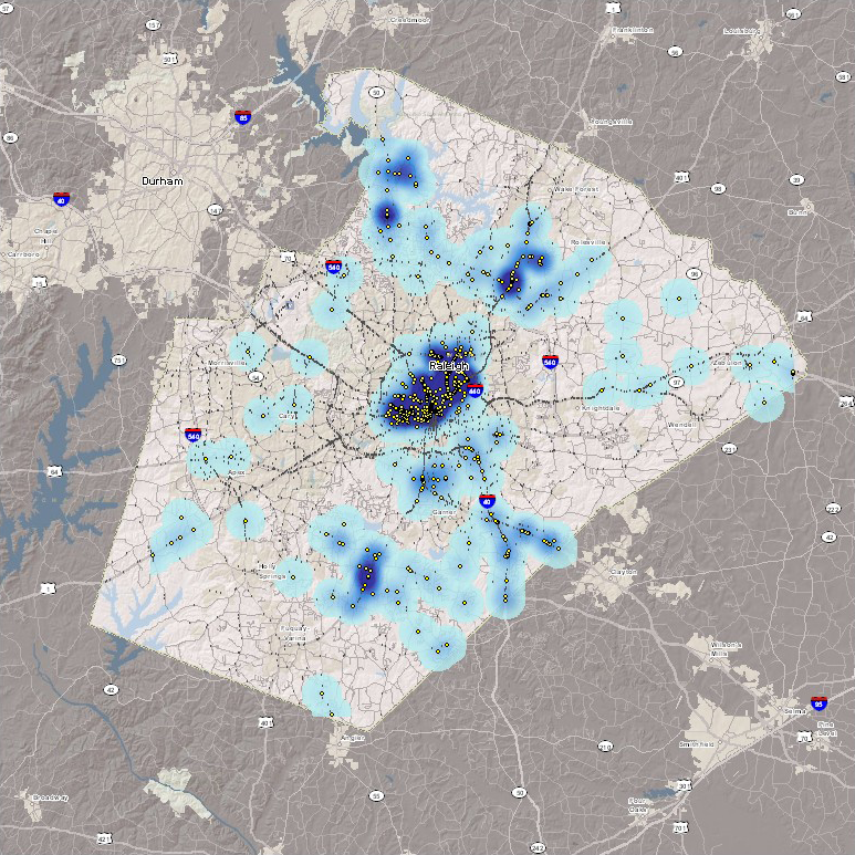
Where high or low severity crashes are statistically grouped.
Where are crashes more or less similar to each other than you would expect by random chance?
This map shows where high severity crashes are surrounded by other high severity crashes and low severity crashes are surrounded by other low severity crashes. The ArcGIS Cluster tool (Anselin – Local Moran’s I test) was used with crash severity as a weighted value. A kernel density heat map of high severity crash clusters (95% confidence interval) was then created to help visualize the spatial distribution of the clusters.
Clusters are useful for identifying where different types of crashes are occurring near each other (i.e. speeding, following too close, severe crashes, etc.). COVERLAB staff is also testing several other methods including the Equivalent Property-Damage-Only (EPDO) and Empirical Bayes (EB) methods.


